
May 20, 2019
After getting my dashboard running for the uThing:VOC sensor I talked about in my previous post, I thought it would be a good exercise to try adding a new readout to the dashboard provided in the linked guide. All code I reference in this guide will be posted in my Github page that’s linked at the bottom of the left sidebar! I’ll also post the new Grafana dashboard code if you want to compare.
The data itself is sent in the influxClient.write_points command and is in a JSON format. This format, which stands for JavaScript Object Notation, is a human readable file format that’s useful for storing and sending attribute-value pairs to things like storage servers.
The values we use in Grafana are sent one line at a time in the following format:
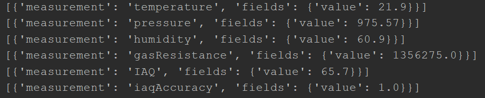
As you can see, each value is sent first with a ‘measurement’ attribute and value of the type of measurement. Following this is an attribute of ‘fields’ which has a nested pair of ‘value’: (number).
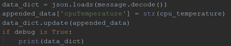
If we want to add to the data sent to our Grafana server, we’re first going to have to add a new measurement. For the example, I’ve chosen to send in my CPU temperature using the psutil library.
This process is as simple as appending a new attribute-value pair to the existing list of values. Once you’ve read in the value you want to append, set it equal to your predefined JSON compatible variable and the new data will be written along with everything else!

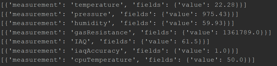
Here is how your new data packets should look after this is done:
Once you have a new attribute being sent to your Grafana server, adding a panel to display the data is easy.
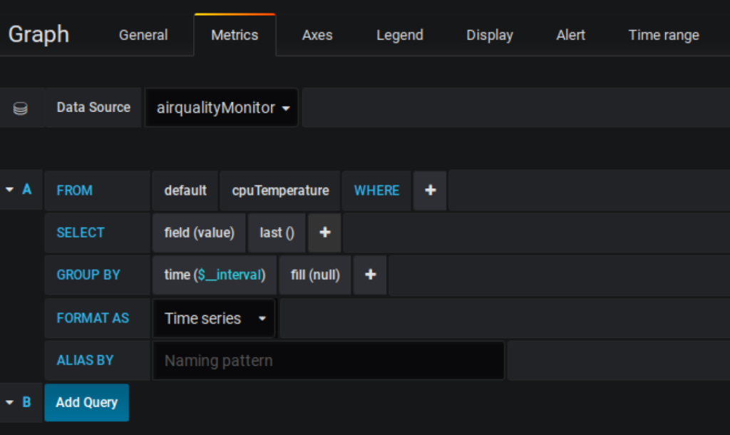
Click on the Add Panel button in the top right of your Grafana dashboard and select Graph. Once there, click on the ‘Panel Title’ placeholder text to open the dropdown menu and click Edit.
Once there, you should be taken to a page with your new graph and a list of options below it.
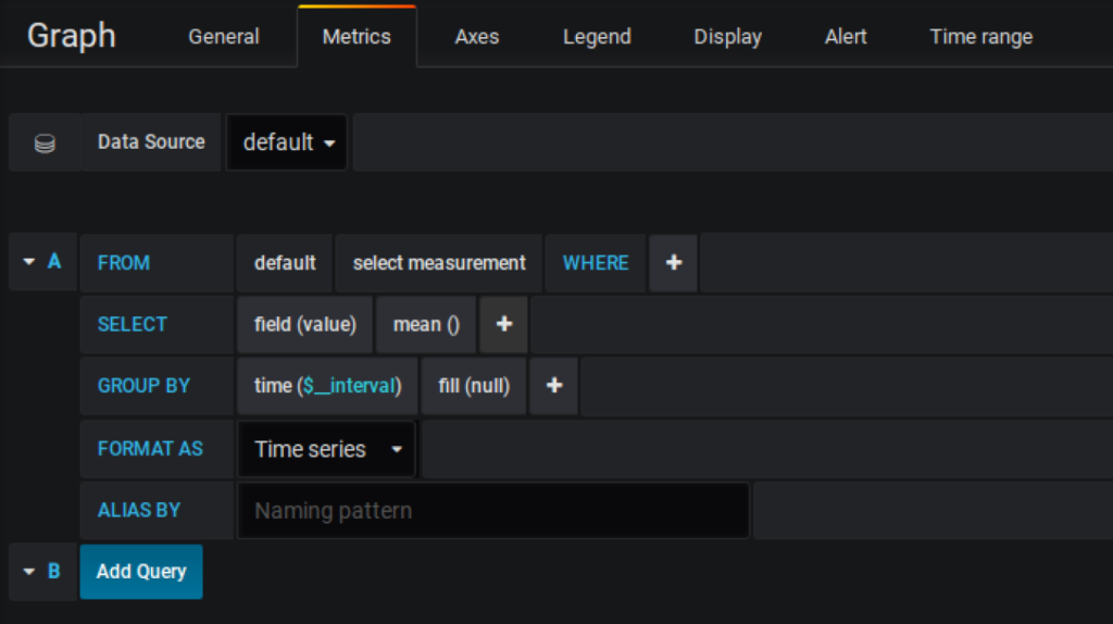
Make sure your data source is set to the name of your InfluxDB database that is being used to hold the existing sensor data. You must also change the “select measurement’ field in the FROM row to the name of the attribute you’re sending. In our case, we need to set it to ‘cpuTemperature’ to match our attribute label in the code. To make the green lines in the graph thicker, click the display tab and check off all the draw mode boxes. Details in the Y axis can be adjusted in the Axes tab. Once done, your graph metrics should look like this:
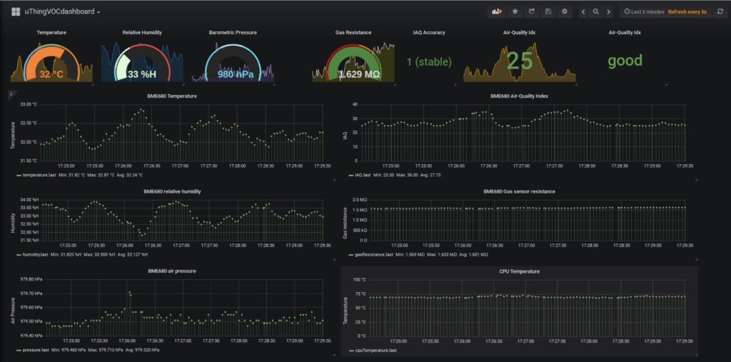
And here is the new dashboard:
If any data fields aren’t updating properly after you’ve updated your python script to report sensor values, try restarting your Pi. I had to do this several times while making this.
Thanks for reading!