September 28, 2020
Extrapolation is the process of projecting future performance assuming that existing trends will continue. Assuming trends continuing exponentially is a little unrealistic when it comes to data associated with the real world, but can be useful for short to medium term estimation.
Python and Numpy specifically are excellent tools for data analysis and can be used to extrapolate in various ways. I’ve written a few posts about Numpy’s uses and have compiled that knowledge into a small program that can be used to extrapolate through the creation of polynomials of an arbitrarily large degree. This can be thought of as a continuation of the previous post about regression analysis in Python since I use a lot of the same concepts in this program.
As far as data formatting is concerned, the program is written to work with .xlsx files that are formatted with a column of dates beside a column of values.
It uses an open source library for working with these files called OpenPyXL and so requires other details about the document such as the name of the specific sheet that your data is associated with. Upon opening the program, you will see this screen:
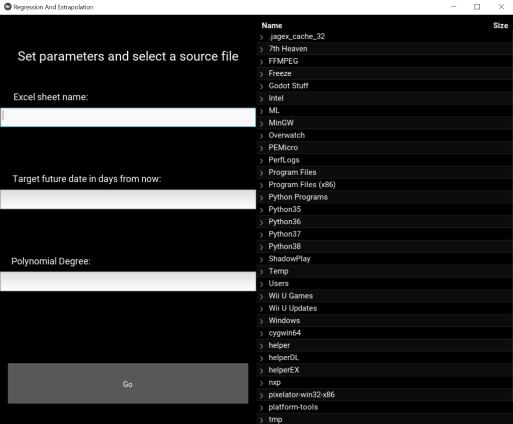
From here you can enter various fields that will change how your data is read and interpreted, as well as a selection tool for picking the file you want to analyze.
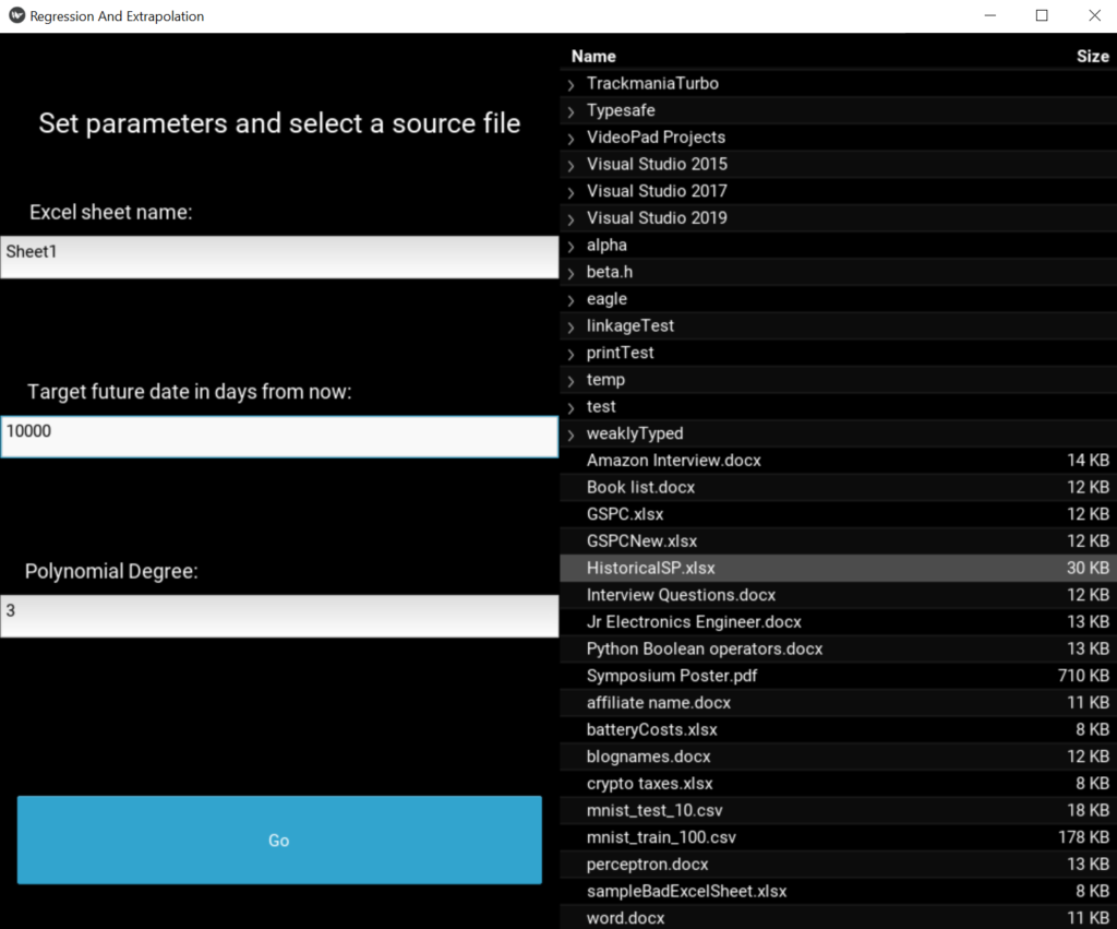
The GUI was made with a Python GUI library called Kivy. I found it a little confusing to use at first since it is designed to work by linking Python code with its own proprietary scripting language, but it has been a great tool for quick GUI development.
Once you are satisfied with your entries and have selected a source file that is properly formatted, click the Go button and another window will open. In this example, I’m plotting historical values of the S&P 500 which is an index of value of the largest 500 US companies by market capitalization as of mid-2020:
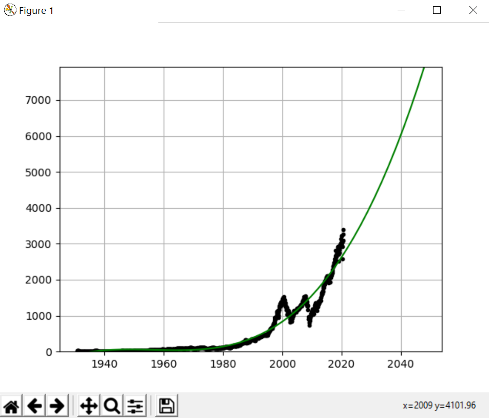
Matplotlib is used for the data visualization. In the example, a 3rd degree polynomial is used, but the field is open to play with and see how different values affect the resulting curve. The value of the polynomial can drastically change what the extrapolated data will project to so it’s up to you how conservative/aggressive you want to be. As always you should keep in mind that past performance is no guarantee of future results!
Source code for the project can be found here!